New Online Fabric Portraits Workshop

I am very excited to announce the launch of my new fabric portraits online workshop called Facial Expressions.

Me relieved that the end is in sight.

The prep has been crazy! There is a huge amount to learn when setting up an online course. Most of the learning is how to use the technology involved. There were many days when I wanted to pull all my hair out!

But now I am ready for the launch. Finally!! I am looking for people to join my Workshop Launch Team. These special people will take the workshop and offer me feedback on how I can fine tune the content.

If interested, check it out here on my Online Workshops Page.


Correcting your Mistakes 101 – A Rescue Operation

Mistakes happen! Have you worked on a project for a long time only to find out that there is a major flaw?? This was my experience recently.

The Problem

First of all, I had been letting other aspects of my business take precedence over making art. My wakeup call came when I was talking to my hairdresser the other day. She asked again how I was doing with my hockey boys. I was a little embarrassed to have to say “not much”. I decided right there and then that I would get the last pieces of fabric in place starting that day.  It only took me 2 hours and it was complete! I was elated!! 

With the assistance of my husband, I carefully took my “boys” off the design wall. My experience with having this piece on the design wall for a long time is that humidity and Steam a Seam II Lite don’t go well together. A story for another day! 

As a result, I had to make sure that all the fabric pieces were back in place before I fused all the applique. A long time later it was done. It felt so good!! I had the design complete!

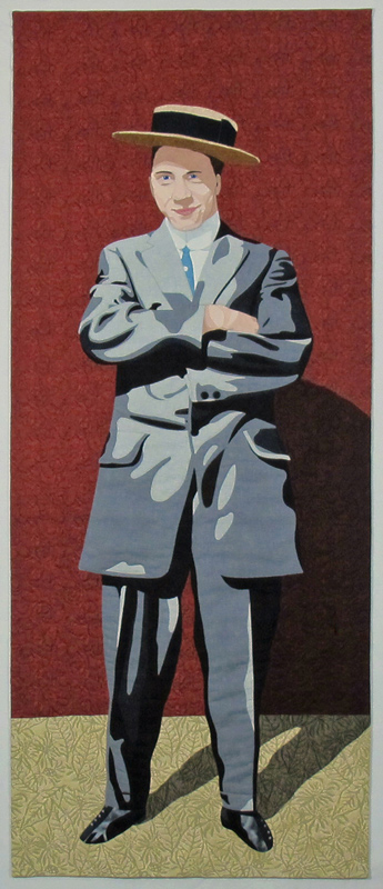
I hung the piece back on the design wall and moved my work table so that I could take a good long look at it. That was when I realized to my horror that one of the 3 boys had a distinct lean to one side!!! One of those “yikes” mistakes. I was devastated. All that work and now it was ruined. 

Three boys in vintage hockey uniforms. Boy on the right is leaning to the side.

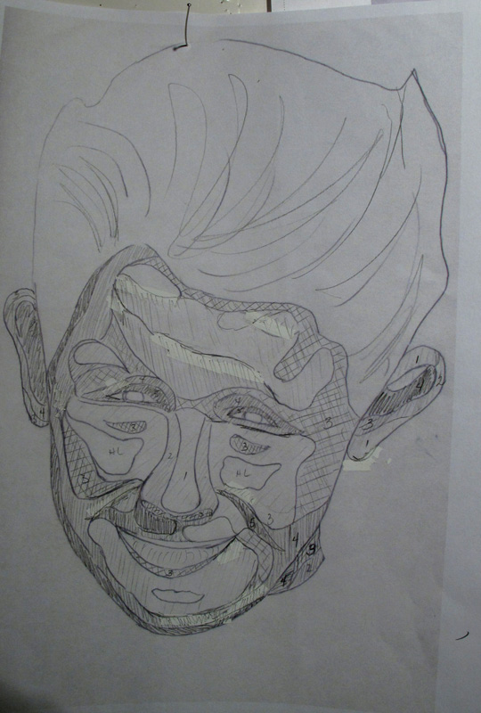
The hockey boys. Look at the guy on the right!

Of course, I did the only thing that made sense. I ranted and raved and cried a few tears. I didn’t even want to look at it.  Over the next few days, I kept going back to take a look and see if it was really as awful as I imagined. Some days I almost convinced myself that it was OK. Other days I was more realistic. 

The Solution

A few days ago I decided that it was time to stop thinking about it and to try and do something about fixing it.  It couldn’t remain as it was. I had decided on a rescue plan. 

The decision was to cut from the top of the background right down to the toe of the skate. I was hoping that I could pivot the boy on the right over to the left without distorting anything.  A very deep breath and I started!

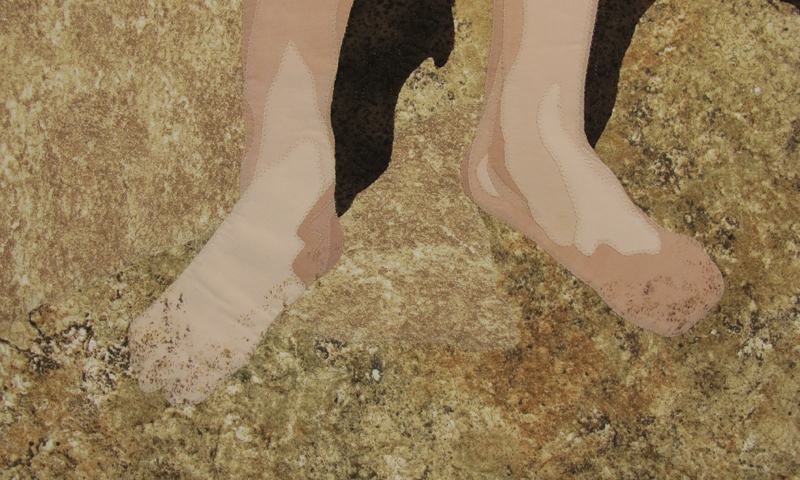
I started by cutting the background fabric above and to the right of the boy’s head. I then cut carefully along the line of his hair on the left side, down along the edge of his sleeve and the rest of this clothes and down to the toe of the skate. Managing to loosen the fabric pieces, at the elbow and the hand where the two boys overlapped (see below), made it easier to cut them apart at that point.  I wanted to cut as close to the figure as possible without nicking any of the edges.

Detail of overlap of sleeves and mitt/hand.

Detail of overlap of sleeves and mitt/hand.

Once I had the boy on the right mostly cut out, I pivoted him towards the boy in the middle so that they overlapped more. I had to cut away parts of the mitt to avoid shadowing and decided that the boy in the middle should have his elbow on top, not underneath as originally planned, which entailed more very careful cutting.

Then I had to adjust the shadow at the elbow of the jersey, for the boy in the middle, by adding some lighter fabric, as now his arm was on top. I used white Elmer’s glue applied in tiny dots to hold the repositioned section in its new position.

The Result

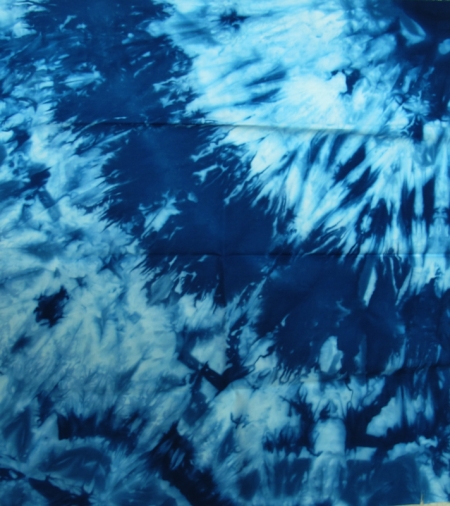
It worked!! I am pleased with the result and learned that the hand-dyed fabric that I used for the sky blends beautifully when cut. My hope is that the quilting will help to hide the cut in the fabric.

Here is the after photo. Much improved.

Three boys in hockey uniforms standing straight. Mistake corrected.

Adjustments made!

I am so glad that I got up the courage to correct this piece. As a result, I have learned that making a mistake is not necessarily the end of a piece. If you give yourself time to get some emotional distance from the problem and you open your mind to the possibility of rescue, amazing things can happen. Mistakes can be corrected.

Have you ever made a mistake or mistakes in a piece that you loved? What did you do about it?  I would love to hear about your experiences! 

How to Create Facial Expressions in Portraits

How do you come up with the best facial expressions in a portrait?

Here is a new way of creating faces that will make it easier for you to get a good likeness in your portrait.

In the past, I traced the contours of the faces from the enlarged photos and then determined the values. I proceeded from there by creating the face out of fabric. I found that I wasn’t always totally happy with the results, particularly if I had too large a section of highlight.

Photo showing the tracing of a boy's facial expressions.

Tracing of boy’s face

New Method for Faces

So, what to do? I started in the same way by tracing the face, but then photocopied and printed the traced image, so that I had a copy that I could alter without changing the original.


Photo showing the photocopied tracing of a face (facial Expressions) that has been adjusted for the values.

Photocopied and adjusted.

I shaded in the face based on the values that I wanted and then checked to see whether I liked the result. You can see the numbers that I use for referencing the different values. The only problem with this method is that the photocopy doesn’t erase like a pencil drawing would. You can see the White Out that I used to remove some of the lines.

This is the second face that I did with this method:

A boy's face (facial expressions) showing the shading for a portrait.

Boy’s face 2

Once I have what I think is the best result, I lay the tracing, as seen above, back over the photocopy and adjust the lines on my original tracing. I use this traced image for the placement of the fabric pieces.

The Finished Face

And here is the result in fabric:

Boy's face recreated in fabric.

Boy’s face recreated in fabric.

I really like this method as I readily notice any odd lines, or shapes, and can double check the values that I have selected before I start cutting up the fabric.

These boy’s faces were difficult to create. The original photo had all the boys looking into the sun and their eyes were all squinty and the faces were somewhat overexposed. This is the time when a good book on sketching comes in handy. I am currently using “The Big Book of Realistic Drawing Secrets – Easy Techniques for Drawing People, Animals and More” by Carrie Stuart Parks & Rick Parks. It has really clear visuals for sketching and is a great reference for facial expressions.

Comments

What do you think of this method? Do you sketch your pictures first? What is your favourite reference book?


Solo Show Update

Read about the latest news on my art work, and an update on my solo show at the Portage & District Arts Centre in Portage la Prairie, MB held in April/May of this year.

Fred

The first portrait is a man standing in the doorway of an old building. Is it his home or is it his workshop? He is dressed in his finest clothes, which must have fit him well as a younger man, but now hang on his body. In spite of this, he displays a quiet pride and shows off his prized gold pocket watch.

Fred

Fred

I experimented with hand-dyed cheesecloth to give the effect of weedy ground, and strips of hand-dyed facial wipes for the weeds. Have you ever tried these type of materials in your work?


The Dandy

The next portrait was based on a picture of a young man who looked very much the dandy, so that became the name of this one. He looks very self assured and definitely has attitude. Don’t you just love the buttons on his shoes!?

The Dandy

The Dandy

It was interesting doing his face, as the shadow of the hat made everything black in the photo; with no detail. I needed to lighten the shadow and redraw the eye.

Then I ran in to another issue. I created one leg of his pants only to find that if I went with the dark shadow, as per the photo, it looked as though he was wearing a jacket and pants, not a suit, so the leg of his pants was redone.


Ed

The third portrait was a commission from a colleague. The photo chosen was a portrait of her husband to be completed for a birthday present. The photo she chose was one of her husband in the early 1940’s in his Air Force uniform. I sourced an original cap badge, the flash for his jacket and the uniform button to dimension to the portrait. Many thanks to Marway Militaria here in Winnipeg for their help finding these items! The hat was done with trapunto on one side to add the tilt to the hat.

Ed

Ed


My Solo Show

Here are some photos from the show. The first photo was taken just after the show was hung. The rest of the photos are from the Opening Night.

Pre-show

The show has been hung!

Opening-night---Ed_Willy-and-her-sister-(web)

Opening Night and the Show Banner

Wall of the gallery showing The Dandy.

Inspecting “The Dandy”

Opening-night5-(web)

Opening Night Crowd at my solo show

Opening-night6-(web)

Getting up close.

The gallery was great on PR so I had several interviews on local radio stations and a write up in two newspapers.  The evening started off with my talk about my journey as an artist, followd by a question and answer period. I invited friends and people interested in my work and we had a wonderful turnout with lots of great discussions.

Have you completed any new work recently? Do you show your work? Where do you show your work – group exhibits, quilt shows or ???


Snow Dyeing Fun

Snow dyeing is a very fun process. A friend and I decided to play with snow dyeing, while there was still some snow. We are having a very mild winter!

When you snow dye, you put your soda ash soaked fabric (wrung out) on a grate in a pan. We scrunched up our fabrics to get maximum mottling. The next step is to add a pile of snow on top, covering the fabric. Sprinkle dye powder over the top of the snow, and wait. Once the snow has all melted, usually overnight, you can rinse the pieces of the excess dye and see what patterns and colours will be revealed.

Here are some of the results of our snow dyeing:

val-hand-dye5

This one was twisted up and put in the bottom of the pan, under the grate. So it was dyed by the snow melting and the dye going into the bottom of the pan. Wonderful!

snow dyed with Raspberry and Grape dyes


On this piece, I used a combination of Raspberry and Grape dyes and not a lot of snow.

val-hand-dye3

These two pieces were from the same batch. I layered the pieces and instead of dye powder used dye solution on the snow. I used red, yellow and green dyes Resulting in a lovely peachy colour.


val-hand-dye4

This piece of fabric turned out to be a cotton/polyester blend. It created a delicate heathery texture to the colour, as the polyester fibres in the fabric didn’t take the dye.

val-hand-dye6

This blue got a few dark marks as it was left to get too dry and the dye concentrated at the top of the folds. There is Interesting texture though.

Have you tried snow dyeing? What results did you get?

The Boys in Blue

The phrase “the boys in blue” makes me think of policemen. Not here!

Here it is two men in vintage navy blue bathing suits enjoying the sunshine and the beach. I love the old style of bathing suits!

Two men in vintage bathing costumes, standing on the beach. Commercial and hand-dyed cotton, paint. Valerie Wilson 2015

Men in vintage bathing suits. Commercial and hand-dyed cotton, paint. Valerie Wilson 2015

This quilt will make a great companion piece for another of my quilts “The Bather” that is currently being exhibited at the World Quilt Show.

The Bather

Can you imagine wearing one of these suits?  They were often made of wool. Wool makes me itch! And it is reported that these bathing suits were very heavy when wet. 

Anyway, back to the two guys.

What intrigued me about this photo and these two guys was the differences between them. One fellow is tall and muscular looking, and has wonderful curly hair, while the other man is a little flabby looking with slicked-back hair. They both looked as though they were having fun, however.

Here is the original photo:

Two men in vintage bathing suits standing on a beach.


I had a few problems with the one fellow’s hand, as he must have moved as the photo was taken, and it blurred that part of the photo. I referenced a number of drawing books and had my husband model that posture so that I could see what the hand should look like and what size it should be. I think that it turned out well.

The other issue I had was that the men are looking into the sun and squinting, and all you can see is black slits where the eyes should be. I thought initially that I would just use a dark fabric there, but found in the end that I really wanted to be able to see their eyes. So back to the drawing books, and many sketches later, they could see!

Detail of eyes

Detail of eyes

A further issue was that I wanted it to have it look as though they had sand on their feet. How to achieve this effect?

I considered glueing some real sand on!

Beads I felt would be too much and take to long to attach.

Finally, I decided to try some paint. I used some fabric paint and tested first on a scrap of fabric. With much trepidation, I decided that I had the effect that I wanted and that I should now add the paint to the quilt.

Very nervously, I carefully added the paint to their feet and it worked! I was so pleased!

Sand on feet

Sand on feet

Now I am having a problem naming this piece. Friends have helped with suggestions for names, but so far, nothing has felt right.

What is the one man listening to? Did someone call their names, or say something humorous? What would you title this piece with these two men in vintage bathing suits? 

Can you help with a name?

Suggestions welcome!


Girl Sitting on the Step

I have completed the little girl sitting on the step!

Little girl on step - Valerie Wilson 2015.

A little girl on a step – Valerie Wilson 2015.

I love the pink socks and Mary Jane shoes. The colourful polka dot fabric for her dress was a great find. This piece came together well. I am very pleased with her hair, as I tried a different technique of layering small pieces of fabric to create it.

I wonder what her story is?

She looks a bit hesitant and somewhat sad and is biting her lip

Did a best friend not come to play?

Is she all dressed up to go someplace special, and has been told to go outside, but to stay clean, until the family leaves for the event?

Is it her birthday, and she didn’t get the present that she most wanted?

I always wonder about the back story behind the photographs that I use. Do you see a story in this piece?

I think that she needs a name. One person suggested Violet.

Would you give her a name, or name the quilt? Such as “All Dressed Up and No Place to Go” or …………..

Let me know your ideas!


Little Girl on the Step

As promised, here is my latest piece in progress. The background is done. I had fun working on the door, to get the highlights and shadows in the panels. Having once owned an architectural antique business helped here, as I have seen a lot of this type of panelled door.

A quilt in progress shwoing the side of a house and the doorstep with an outline of a little girl.

Little girl on step – in progress

Isn’t it neat the way that the background defines the space for the little girl? This demonstrates the importance of the negative space surrounding something.

I layered two colours of brown for the boards on the side of the house. I liked the effect but thought that it looked a bit plain, so added some slightly darker bits on top to give it some interest. I am almost out of this fabric and will be sorry to use up the last of it. It has been most useful for portraying aged wood, or fence posts.

As you can see I have started working on the little girl’s face. It looks really strange with only the face there! I may yet adjust the shading on her face, but will leave it for the moment, as this piece is still in the “ugly phase”. I also need to remember that I will be adding detail with the stitching, and quilting, later on. Do you find that your quilts go through an ugly phase before they are complete?


She’s a Cutie! My Latest Portrait Quilt Completed.

A little girl hoding a colourful sand pail stands on a beach.

Summer Fun Quilted

I have finished my latest portrait quilt, the little girl at the beach, and decided to call the quilt “Summer Fun”. She has turned out to be quite cute! I love her sparkly blue eyes and her sweet smile.

Close-up of girl's face

Detail of Summer Fun

Now I have to decide what the next one will be. I have two pictures that I am considering. One is a little girl sitting on a porch, and another is one of three boys in hockey uniforms, circa 1934. Subscribe to my blog, and find out what is next!


Gallery News

“Summer Fun” and a number of my other quilts are currently hanging in the Blankstein Gallery, on the second floor of the Millennium Library in downtown Winnipeg, MB. Here are a couple of photos of the preparations for hanging the show and a few of the quilts.

Laying out the quilts

Laying out the quilts

First we laid out the quilts on the floor, to decide the order in which they would hang. My husband was wonderful as a helper. Here he is putting a hanging rod in one of the quilts:

Getting the hangers ready

Getting the hangers ready

The next step was to actually get the quilts hung. It took us 2 1/2 hours to get it all done! It went faster after the first two, when we had figured out the easiest way to hang them. Here are some of the quilts on exhibit:

Vintage Portraits

Vintage Portraits

Nature's Glory

Nature’s Glory

And here is the view in to the gallery from the library:


View from the entrance of the Gallery

View from the entrance of the Gallery

It was wonderful to see them all hung. I hope that if you are in the area you can check it out! The gallery is open during library hours . The exhibit runs from August 3 – 30, 2015.

From Ugly Duckling to Swan

After I posted my progress on the little girl in the sunsuit, I decided she was in fact rather an “ugly duckling”.

I spent a couple of days, filled with angst before I figured out what was wrong.

Then came a number of changes to her face, hair and her eyes (I straightened them) and I like the result.

Part of the problem was the lack of eyebrows (see the previous post). Also, I felt that her hair looked too orange, so out came the Tsukineko inks.

I figured that if I hated the changes, I could always give her new hair. I am pleased to say that all worked out well! The new colour looks better and the highlights and shadows are in place.

She also now has feet and shoes which helps. Don’t you just love her strappy sandals?!

A little standing on a beach, holding a sand pail.

Girl in sunsuit revisited

I am now creating a beach scene in the background, complete with a sand castle!  So far, I only have a piece of paper standing in for the sand castle, as a prop, to see how it will fit into the scene.

I didn’t have a fabric that I liked for the water, so I painted some white fabric with Setacolor transparent paint. I love the look of the rolling waves. 

A small island in the distance helps with perspective and I have pinned a piece of multicolour fabric in place, as a test, to see if I like it for the sand pail.

If this piece is like any of my other works in progress, it will undergo several more changes before its final look.

Do you go with the flow when you are working on a piece, or do you have a plan and stick to it?

I would love to hear your thoughts on this subject. Please comment.